Spiritual
The
Blog
Brand
The Cost of Spiritual Branding—and Why NOT Investing in Your Brand Is Costing You More
Building a spiritual brand isn’t as simple as picking a logo and calling it a day.
Especially if you’re a heart-led founder or soulpreneur.
Because if that’s you, then I know this: You care about what’s real + honest over appearances. How something feels matters just as much—if not more—than how it looks.
This is what sets apart spiritual branding from traditional branding.
It’s about your brand being a reflection of your truth. Not a mask you put on in the name of your “brand.” (Which is how it feels when your brand is inauthentic.) 🥸
Similar to the spiritual journey, conscious branding is an alchemical process. (That’s why I call my full-service brand offering Brand Alchemy.)
It’s a transformative, deep experience. And the investment you make—financially, energetically, and emotionally in yourself and your business—is worth every cent.
(My clients think so anyway!)
What 10+ Years Taught Me About Building a Spiritual Brand
I wasn’t looking for a guru. I just wanted to quit my day job.
At 23 years old and blissfully naive, I figured I’d start a business…
But somewhere between designing logos and replying to emails, I found myself in the soul-shattering ayahuasca trip known as ‘entrepreneurship.’
Here’s the biggest lesson I’ve learned in over a decade as a spiritual brand designer…
My Spiritual Branding Process: An Inside Look From Start to Finish
Spiritual branding—or as I prefer to call it, conscious branding—is a deeply personal process.
(Which is why I only work with four clients a year on my full service brand offering.)
Spiritual branding doesn’t mean that your brand will look like it was plucked straight off a “spiritual aesthetic” Pinterest search, with sacred geometry, phases of the moon, and a lotus flower. (No shade if that’s your thing.)
Spiritual branding is about tapping into your genuine expression.
God/Spirit/The Universe made you who you are for a reason. And that wasn’t to blend in with everyone else.
Revealing this expression requires an explorative process. (Way more than a short brand questionnaire can access.)
So the first half of my process is spent diving deep with you, to understand you and your business, inside and out, before I even open Adobe Illustrator to design your logo ;)
The 3 Types of Logos: Which One Is Best for Your Spiritual Brand?
Through the spiritual branding process, what began as a collection of colors, letters, and shapes becomes something so much more.
Infused with your energy and intentions, your logo becomes a talisman for your brand.
Talismans are powerful because of the meaning that’s given to them. Not because of how they look, but because of how someone feels from it.
As an example of this idea, think about a copper penny on the sidewalk…
People walk past it, not giving it a second glance. Until someone picks it up because they see it as “lucky.” That penny that meant nothing to others, becomes a symbol of luck to that person.
Like that lucky penny, it’s less about how your logo looks and more about how meaningful it is to you.
With that in mind, there are three different types of logos.
Each type of logo design offers different benefits. There’s no wrong choice—simply choose the one that best suits you and your brand.
What In The Woo Is Spiritual Branding? ✨
I first felt the intuitive nudge to bring spirituality into my branding design business in 2017.
At the time, I had NO idea what that meant or how it would unfold…
It took two years (and a spiritual awakening!) to become clear.
At a crossroads and seeking a deeper sense of purpose in life, I felt compelled to use my business as a force for good, not just personal gain.
I discovered that weaving spirituality into my business was the the only way I could remain authentic and fulfilled in the work I desired to do in the world.
I realized that for conscious creators, spirituality and business aren’t separate. In fact, running a business can be one of the greatest paths to our higher purpose.
Spiritual Branding Case Study for Intuitive Coach, Jewels
I recently finished the logo and branding design for Jewels, an intuitive business coach.
Afterwards, we sat down to talk about her experience of working with me on the process of creating her spiritual brand…
She shared:
How things have shifted for her through this work
What she received that she didn’t expect!
Her advice to other spiritual entrepreneurs considering investing in their brand
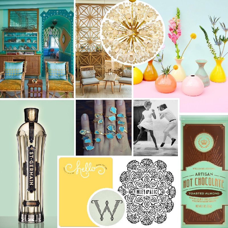
Celebrating 10 Years: A Look at How My Business Has Evolved Since 2012
While journaling this morning, I was overcome with immense gratitude for where I currently am in my business and how far I’ve come since starting Incandescent Creative over 10 years (!) ago.
I started this little design studio within one year of graduating college and it has been through several iterations since. I have designed, refined, and redesigned my logo and brand identity three times. I’ve worked with an array of businesses—coaches, spiritual teachers, photographers, event planners, non-profits, restaurants, and more.
I now feel very grounded in where my business is at in this moment in time. (While acknowledging that it will continue to evolve—change is the only constant.)
So, in celebration of this journey and the exploration that has led me to this point, here’s a look at how my brand has evolved through the years…
Two Simple Updates That Will Completely Transform Your Website (Before + After)
In my new audio course, Generic to Genuine, I talk about how to create a more authentic website. As I was recording the last episode about the importance of design, I realized it would be easier to show than tell…
So I decided to try an experiment.
I took a generic Squarespace theme and ONLY changed the fonts and colors. The layout and all of the content—text and photos, is exactly the same.
The difference is astounding.
The website was completely transformed by those simple design changes. Before, it was subdued and lifeless. After, it’s brimming with personality; it’s more vibrant, compelling, and inviting. (Keep reading to see the before and after!)
