Two Simple Updates That Will Completely Transform Your Website (Before + After)
I decided to try an experiment…
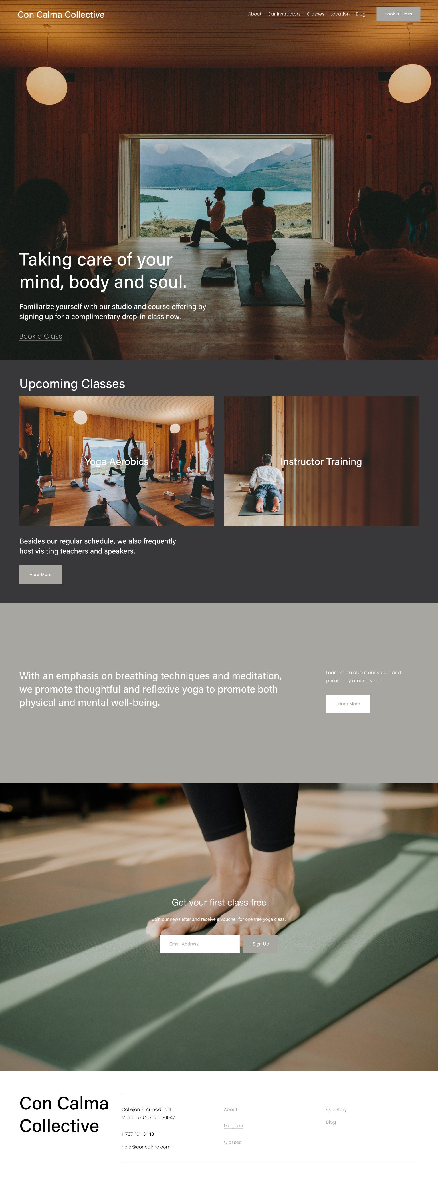
Using a generic Squarespace theme, I ONLY changed the fonts and colors.
The layout and all of the content—text and photos, is exactly the same.
The before and after is astounding.
The website was completely transformed by those simple design changes…
Before, it was generic and lifeless. After, it’s brimming with personality; it’s more vibrant, compelling, and inviting.
Here’s a side-by-side comparison…
Before —
After —
Why is it that something as simple as fonts and colors can have such an impact on your website?
It’s because there’s a breadth of information being communicated subconsciously…
Design is more than superficial appearances. Design is visual communication—it tells others who you are in a non-verbal way.
Beyond words, this form of communication is subtle yet powerful…
Visuals evoke emotion far more effectively than words. 90% of the information processed by the brain is visual. 1
Which translates to a tangible impact on your business:
94% of people determine whether or not to trust a business based on the website design alone. 2
Before someone reads the first word on your website, they already have a perception of who you are. (Yikes…)
But the good news is that you can shape this perception as quickly as you can change update your website fonts and colors. (Yay!)
But you don’t have to totally redesign your website to improve your trust factor...
All you have to do is define these two key visuals: your fonts and colors.
How do you know what colors and fonts to use?
You first get clear on who your brand is and what it represents. (Need help? Check out this free audio series to do exactly that—in only 20 minutes!)
Then you select the fonts and colors that best reflect that. (Or hire a designer to do it for you!)
Each font has a personality and each color has its own associations.
When used together, these elements convey an overall “vibe.” Known as your visual brand identity, it communicates who your business is, subconsciously.

