
The House of Helena
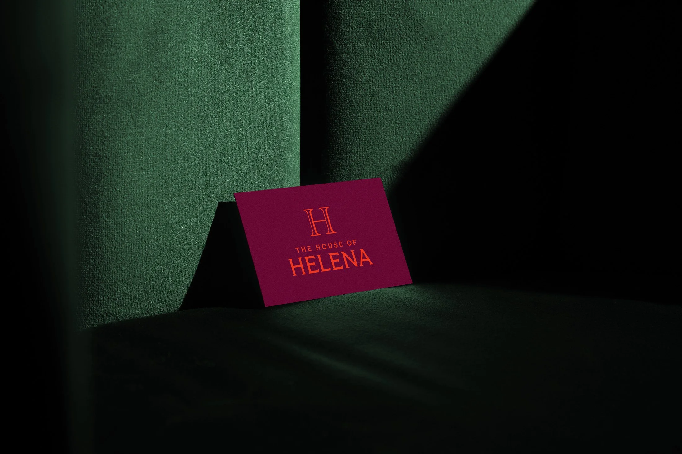
The House of Helena is the living temple space of goddess oracle and spiritual guide, Helena Murray, established to lead the modern divine feminine to the remembrance of her Priestess power.
DESIGN SERVICESCreative Direction ✷ Logo & Visual Brand Identity Design ✷ Web Design ✷ Print Design


ABOUT THE REBRAND
Offering spiritual guidance sessions, as well as talismanic jewelry, poetry books, and more, Helena had been operating her business offline and felt ready to bring her website vision to life and weave all of her offerings through one portal. She was guided to me and deeply resonated with my energy and ethos. Together, we co-created the visual expression of her business through her logo and brand identity design, website, and print materials.


SYMBOLISM OF THE LOGO DESIGN
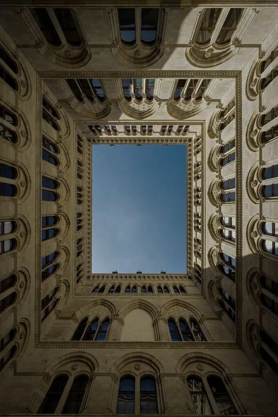
The logo design is architectural and temple-like. The letterforms evoke classical Greek architecture—an ancient dedication to the goddesses that still stands today.
The H monogram stands for ‘Helena’ and represents Ionic columns and the High Priestess, an expression of the divine feminine who is seen in the tarot as sitting between two columns. The contrast within the monogram represents the duality of light and shadow.
Overall, the brand design conveys a balanced sense of masculine structure providing containment, support, and safety for the divine feminine. While also expressing a lush sensuality that conveys the energy that Helena embodies in her life and work.
Through the brand strategy process, we unveiled the deeper meaning of Helena’s brand. This provided a foundation for the direction of her logo and brand identity design.
Three goddesses guide the brand: the Love Goddess, Green Goddess, and Dark Goddess.
Representing the archetypes of the Maiden, Mother, and Crone, together, they create a dynamic expression of the divine feminine. They also represent the cyclical journey through Heaven, Earth, and the Underworld that is key to the spiritual path.
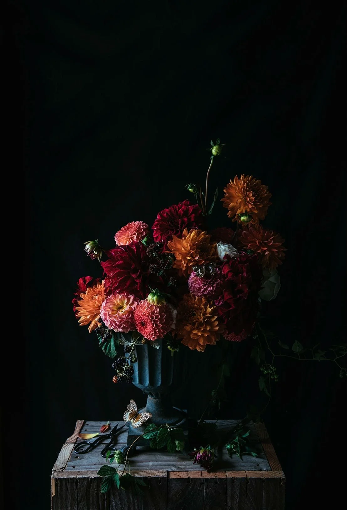
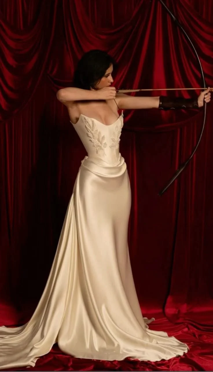
This translated to the creative direction of the brand identity through three motifs:
Sensual Glam: Representative of Helena’s past life as a jazz singer and an expression of the Love Goddess
Dark, Moody & Brooding: Dimly-lit, moody imagery conveys the Dark Goddess and the voyage into the Underworld necessary to expansion
Vibrant, Wild Nature: Bright colors add a playful and unexpected contrast to the predominance of dark sensuality, and represent the vitality of nature and the Green Goddess

HELENA ✷ GODDESS ORACLE & SPIRITUAL GUIDE
You’ve captured me & the brand so well.
“I had tears in my eyes because I loved (the website) so much. Watching your walkthrough was magical. I love it—all of it, to be honest! It’s beautiful. I love the colors, the layout, how it all flows… you’ve captured me and the brand so, so well.”


